Has Minimalissimo really been running for 10 years?! It's a question I've asked myself more than once. It's something I'm incredibly proud of actually. Running and sustaining a high-calibre site like this is not easy. It requires a lot of dedication, love, and most importantly, consistency. There's no doubt in my mind that beyond the consistency of publishing the best in minimal art and design, we have continued to improve our curation and editorial quality over the years. Yes, user behaviour has evolved since 2009 in terms of how readers consume digital content, but there's a lot to be said for sites that can stand strong amongst a sea of social media profiles, design blogs, and digital magazines. Minimalissimo does that—and does it well.
So to celebrate our 10 year anniversary, we have made some big changes. We have rebuilt the Minimalissimo site from front to back.
But first, how did this niche site start?
Minimalissimo started back in 2009 by Maarten Kappert and Stan Grootes. They created something pretty special and something very different at the time—a place where readers can simply come and spend hours, immersed in the diversity of some great minimalist art and design. This was before the days of mass social media such as Instagram and Pinterest, so it was a great resource for people looking to discover simple, interesting designs as well as inspiration. I joined the team as an editor back in 2011, and subsequently took it over later that year. Minimal design was something I was becoming increasingly passionate about, so it was a good opportunity and challenge for me to see where I could take the site, if even working on it part-time (which I continue to do to this day).
From there, I’ve done my best to drive the site forward, working with some talented and committed curators and writers, a complete rebrand, three printed magazines, as well as four significant site redesigns (let us forget the 2016 version). It hasn’t been until the last two years that I have really felt that we are on the right path though. I owe a lot of that to Manu Moreale—a ridiculously talented web developer and minimalist through and through. Working alongside someone like that has really helped put things into perspective. It is why we now have a wonderful site, coded beautifully, and at the risk of sounding immodest, designed beautifully too.
We have achieved all of this by working entirely remotely. Working remotely is a significant advantage yet also a big challenge. Coordinating an online team across time zones is challenging and can be frustrating at times. While we depend on each other for certain tasks, it doesn’t matter where or when you work as long as you get the work done.
Since 2009, when blogging was at its height, we were generating some serious traffic to the site. Considering how the web has evolved over the last decade, it’s natural and completely expected that site traffic will lessen, unless you invest thousands, if not millions, into advertising and marketing. We don’t do that—at all. Yet, here we are, still going strong.
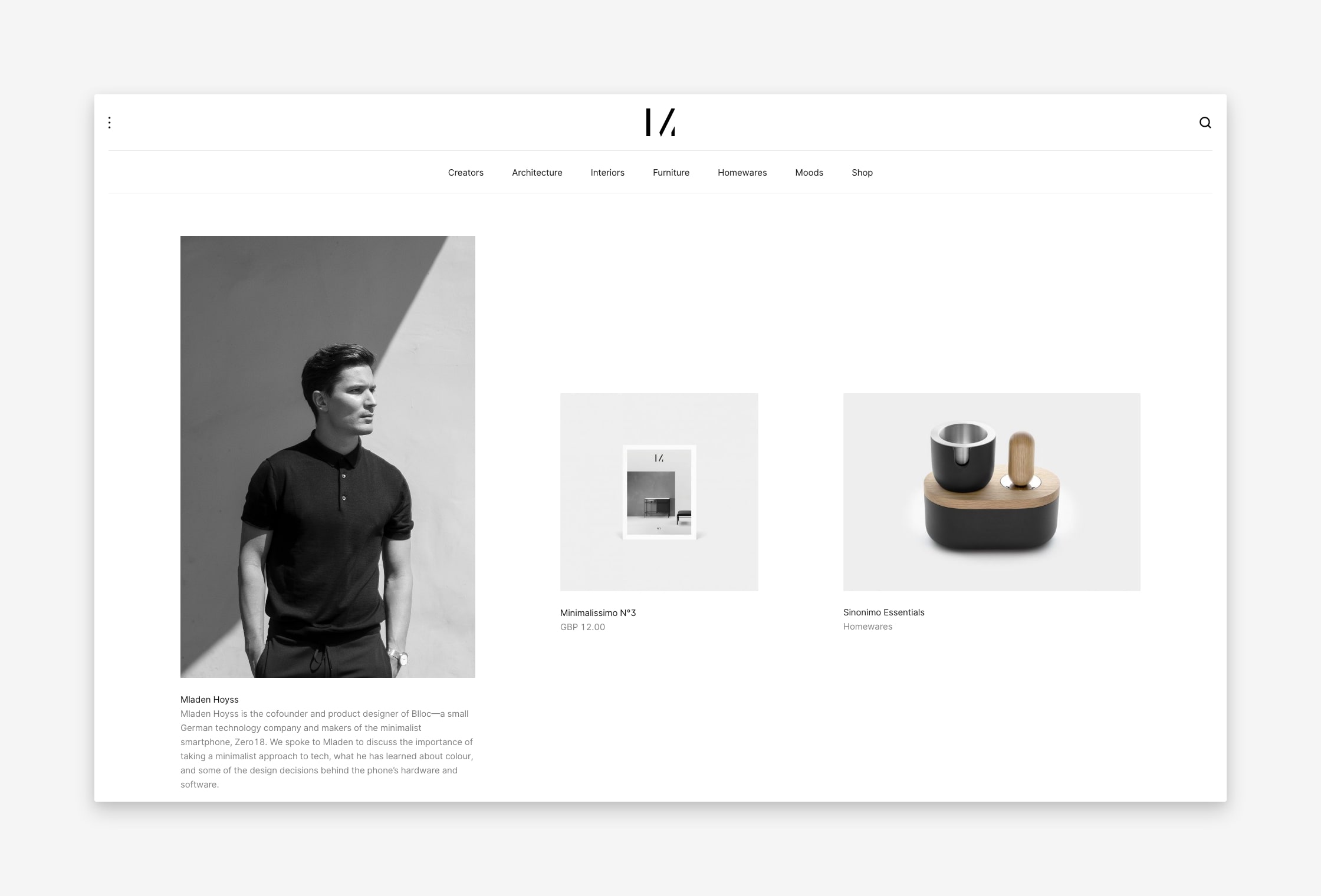
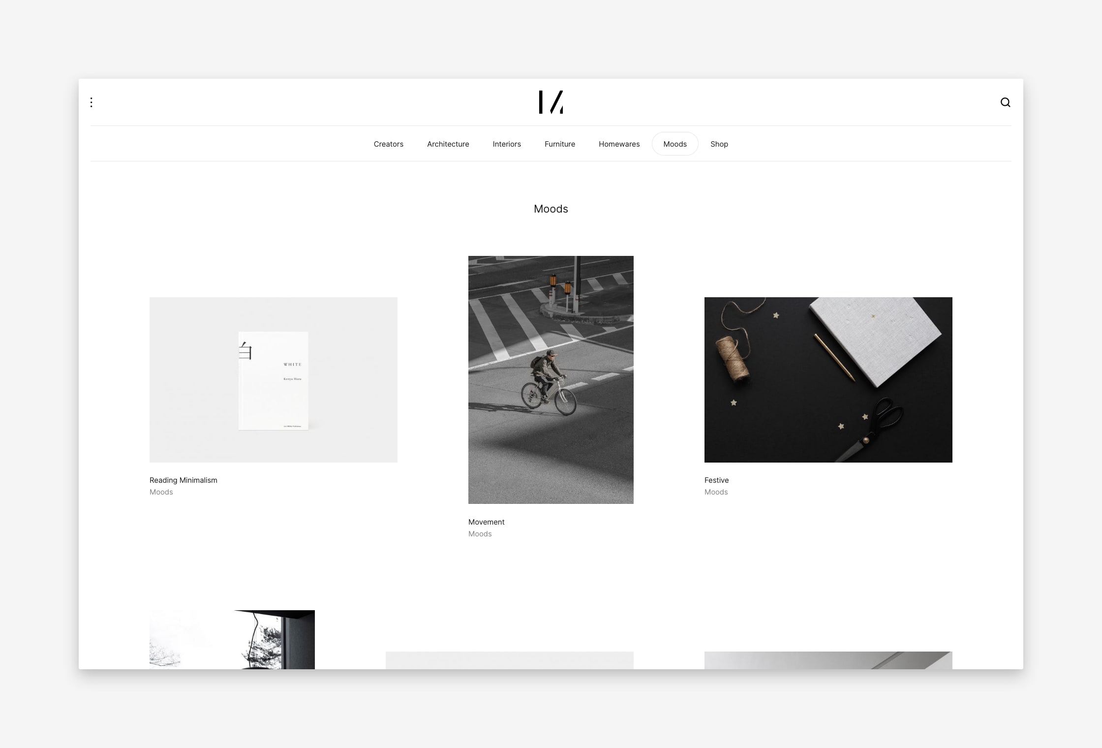
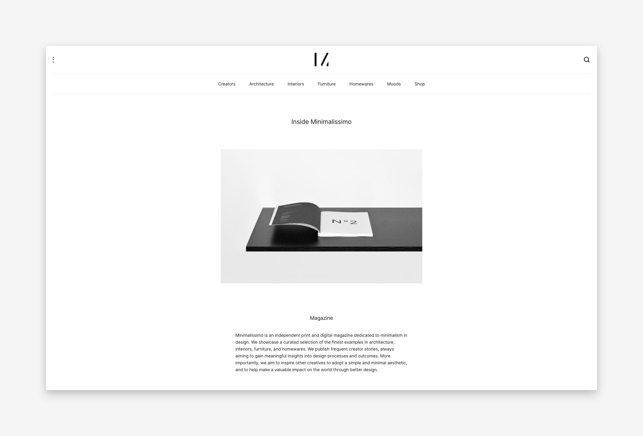
So let’s take a look at what Version 5 of Minimalissimo looks like:


Our New CMS
We have been using WordPress since we started, but we scrapped that and went for a much better fit: Kirby. This is an incredibly flexible and lightweight content management system that has no database, and instead uses a file-based structure. We completely customised the backend admin panel, which we use to edit and publish our content. You probably don't care about this part, but it's a massive change for us, and a fantastic one at that. If you have any questions about it, then drop a note to our web developer Manu.
Our New Site Design
Our design is very different, but also quite familiar. It is actually somewhat similar to our original site design back in 2009, but has a lot more design precision, it's lighter, and has a markedly improved performance than all our previous versions, which ultimately improves the overall reading experience.
Structure
Our editorial structure has changed a little. We have decided to have a more streamlined editorial approach. We are focusing our features on a smaller range of disciplines and topics, which are highlighted in the main menu. We went with this approach after inviting readers to engage in a survey to express what they liked, disliked, and wanted to see more of. Our feature articles will offer a deep-dive into projects, as opposed to our previous short-form overviews.
In addition, we are treating creator interviews with greater prominence. We came to the conclusion that in general, people enjoy reading about people more than things. So we want to get to know creators better—their approach to design, work processes, learning outcomes, and life outside of the studio.
A brand new feature we have introduced is our Moods section. This is essentially a visual-only curation of moods of wide-ranging topics. It's a great space for visual-inspiration and experimentation without the editorial.
Grid System
Our grid system is perhaps the biggest design change. We are using a combination of both flex and inline-blocks items. The grid works superbly on all display sizes—from the ultra wide desktop to the little smartphone. We are applying strict aspect ratios to all imagery for consistency. These are 3:2 (landscape), 2:3 (portrait), and 1:1 (square).
Typography
We have decided to change up our typeface too. Far the past 3 years or so, we have been using Avenir by Adrian Frutiger. This was used in both print and digital materials. We have now decided to use Inter by Rasmus Andersson. We felt this offers a wonderful reading experience across all displays and sizes, it has a very extensive library, and it's continually supported. We will also be applying Inter to our upcoming printed magazine editions.
Shop Integration
We recently launched our online shop, which includes a very small curation of both physical and digital products. This is an ongoing project that we'll continue to develop over the course of next year. Not many of our readers know we even have a shop, so we wanted to integrate this a little more seamlessly into our principle site. However, we have taken a very mindful and considerate approach with this. We do not want our shop to be obtrusive to your reading experience, which I think has been achieved pretty well.
Newsletter (finally)
Has it really taken 10 years for us to create a newsletter? I don't really have a good answer as to why it has taken so long to do this, but as far as I'm concerned, it's better late than never. Hopefully you feel the same way. Plus, I think it's better to have readers who are interested in our content now.
So what will this letter offer? With as little design as possible, this will be a weekly email recapping features published that week on our site, as well as highlighting a particular project from our archive and a product in our shop. We'll also be sharing insights into planned projects, creator stories, and exclusive offers only available to subscribers. We'll probably introduce new features throughout the year as well—we're new to this you see.
Performance
As for performance, there's nothing special going on, but we have tried to keep our code as lightweight as possible. Our new server uses Nginx as the webserver, content is served via http2 and uses brotli compression. We're running latest php version, and we're using memcache to cache the content. SSL is provided by Let's Encrypt. Other than that, the site is just a simple site with no 3rd party services or anything else. You could say we have taken a minimalist approach in every aspect of this site build. And I for one, love that. I hope you enjoy it too.
I also want to thank all the readers who take time out of their day to visit Minimalissimo. The feedback, encouragement, and enthusiasm shown motivates me to keep making Minimalissimo better. For another 10 years, and maybe more.
If you do have any comments or suggestions, please do get in touch.