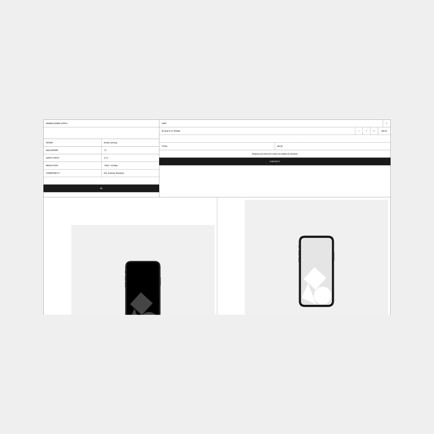
A new design, a new version, a new era, a new chapter, a new wave, a new vibe. Call it what you like. The sixth iteration of Minimalissimo is here and it's probably the strongest one to date yet probably the most raw and uncompromising. But before I break down what is new, I want to explain why we ventured down this path.
We are all heavily immersed in design whether we acknowledge it or not. Everything around us is designed in one form or another, for one purpose or another, or lack thereof. Yet, some of us are exposed to digital design more than others on a day-to-day basis. What I am seeing is a relentless wave of a particular aesthetic. I don't really know what to call it, but I can describe it as soft, safe, slow, and comfortable design. I don't necessarily dislike it, in fact, far from it. I think it has its place. But it seems to be absolutely everywhere and in every thing. Be it web design, graphic design, product design, or interior design. Why are we so desperate to find comfort? Realising this, I felt a natural pull towards something that opposes this aesthetic. A pull towards digital brutalism (yes, this exists). But what began as an act of defiance, later evolved into a genuine appreciation for what a raw approach to design represents: unfiltered honesty.
What does that mean in a design sense? It's probably quite subjective. I can only speak of my perception of it. Honest design does not manipulate people by pretending it is something it is not, or mask imperfections to hide shortcomings, or waste people's time. It doesn't aim to crowd-please, it isn't fashionable or a novelty, and doesn't rely on decorative elements or special effects that want to be seen as design details. Instead, honest design is considered, understandable, and puts utility first. It is has aesthetic qualities that make the experience of using it a pleasure, which happen to align with its usefulness. If it's a work in progress, it will say it loud and clear. If it's experimental, it will not set expectation. Ultimately, honest design is done with good intentions, regardless of the result.
Brutalism might still be a bit austere for many people’s taste. A common public perception is that brutalism became the architecture of a forgotten underclass that depicts crumbling concrete and ugly dystopian soullessness. Far from being something to aspire to, it was instead something to escape from. The name doesn't really offer a sense of comfort either: even though it derives from the French béton brut, for raw concrete, it still suggests brutality.
With this in mind, we might not have produced a trendy or crowd-pleasing design, but sticking with the notion of unfiltered honesty, I don't really care. As the late great Virgil Abloh once said, "I like it, so it's right." Ultimately, what brings people to Minimalissimo is the considered curation, not the package it is wrapped in. Yet, it is the experience of the gallery that encourages people stay, remember, and return. It is minimal, like thousands of other sites, but it is distinctive. And a significant factor of this is the intentional omission of our logo. We have created a unified and considered design that supports the idea that if you covered up or removed our logo, you would still identify that the product or site represented Minimalissimo. Only time will tell if we have actually achieved that, but I wanted to challenge myself to design something without having to rely on a logo to make it a brand. That, and sometimes our developer, Manu, just goes rogue and does whatever the fuck he wants regardless of what I say, yet 99% of the time I end up agreeing with him. So credit where credit is due.
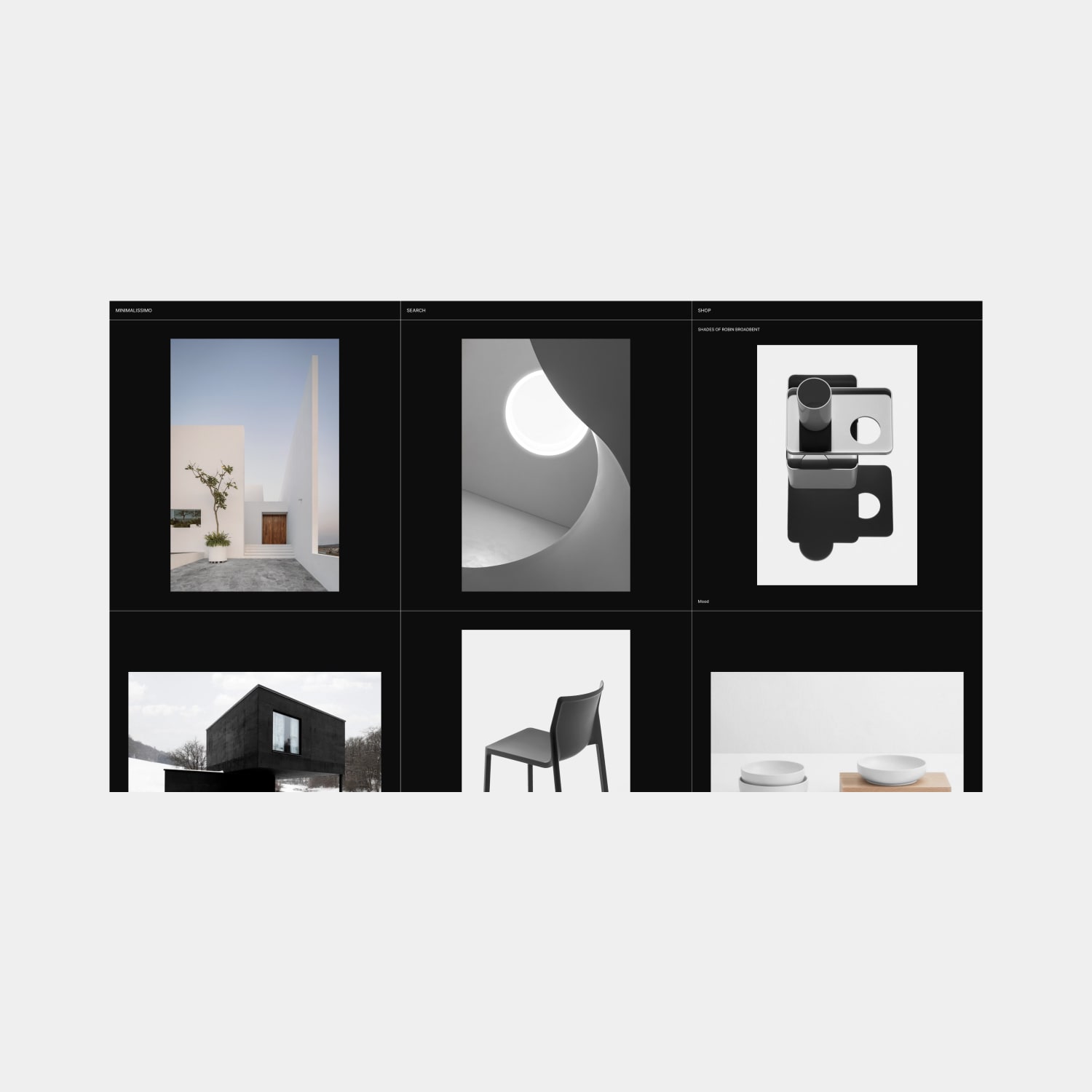
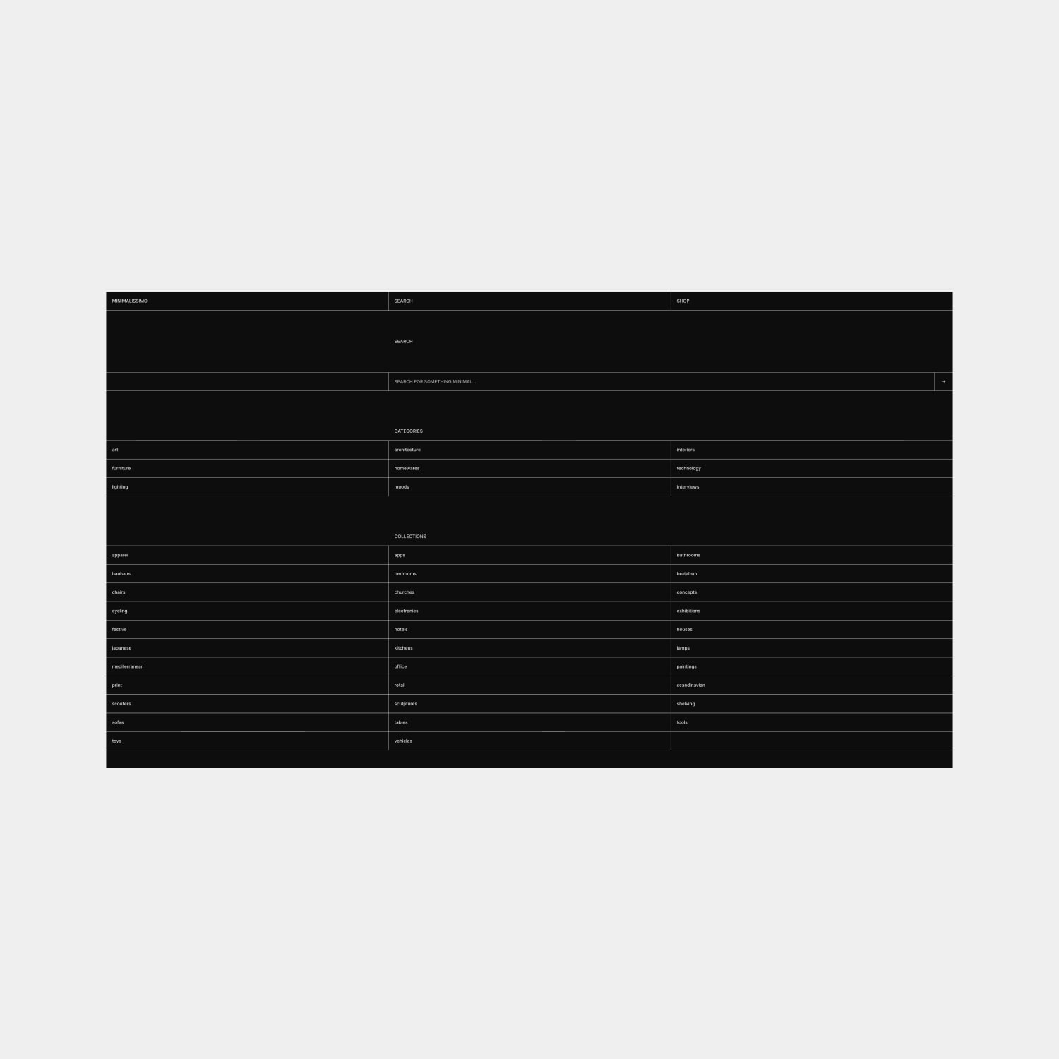
So what is new in Minimalissimo 6.0? The structure remains largely the same as the previous iteration, but we have decided to broaden our range of topics while paring down the editorial side of publications. This is a bit of a hark back to the original version of Minimalissimo that launched in 2009. We overhauled the search and brought it into greater focus. I feel searches are fundamental tools for galleries and with that consideration, we wanted to create a search that offers a little more than a simple input field. Besides additional categories, we have introduced collections, which in essence, are simply tags. Our search has been lacking for years, so we thought it was about time to address that and make it a loved and highly utilised feature of the site.
A subtle yet significant change we have applied is the removal of sponsors in the global footer. We are no longer working with sponsors or advertisers. It's just not compatible. We have always been anti-advertising, but this is a step further and instead we have decided to go all in with our shop as our source of income. So naturally there is a stronger presence of our unique products showcased throughout the site. Of course, we still welcome donations from readers, especially from those we have featured, but any donations are considered bonuses. The reliance on product sales, however, will drive our will to collaborate and create new things to sell, be it digital or physical items. That alone is an exciting prospect.
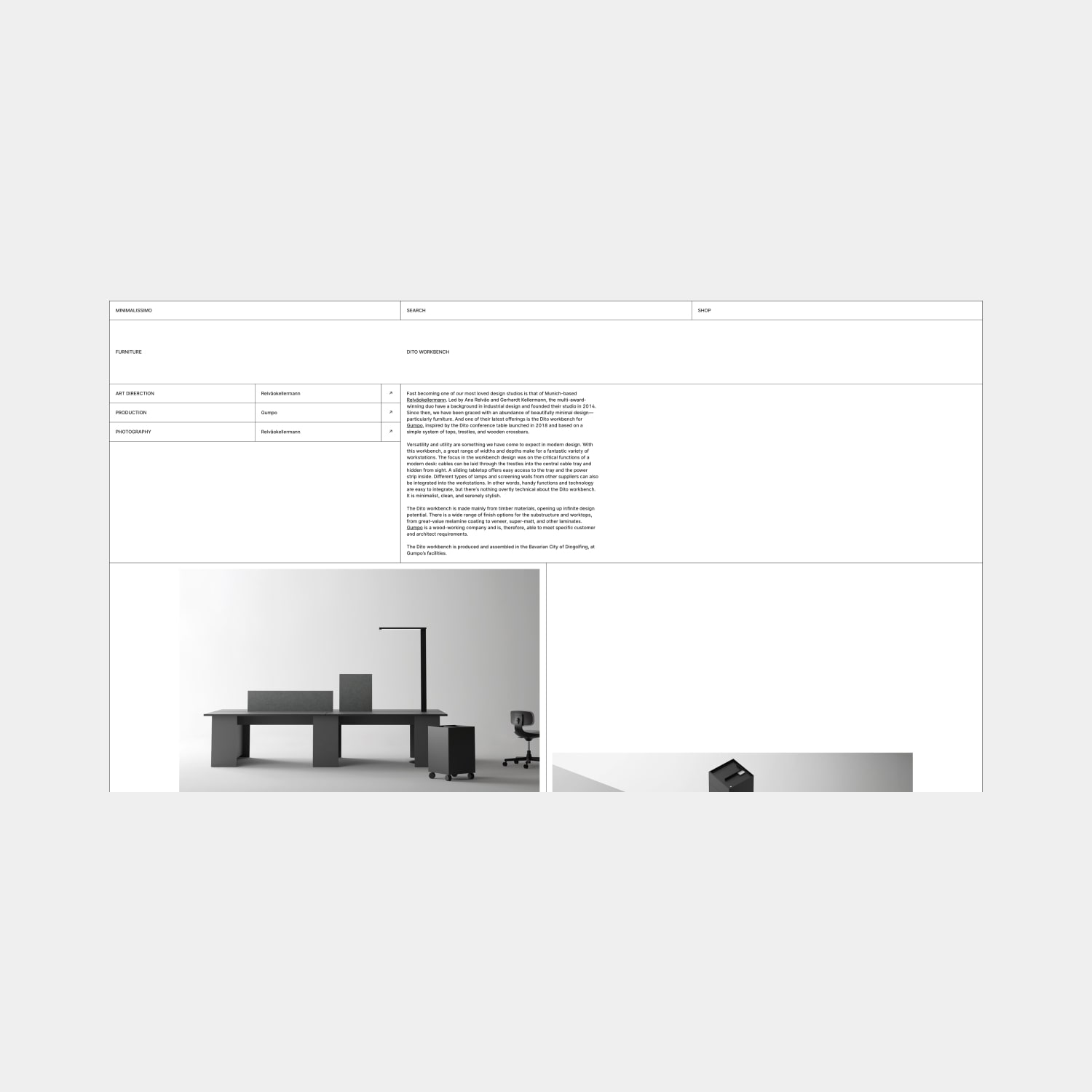
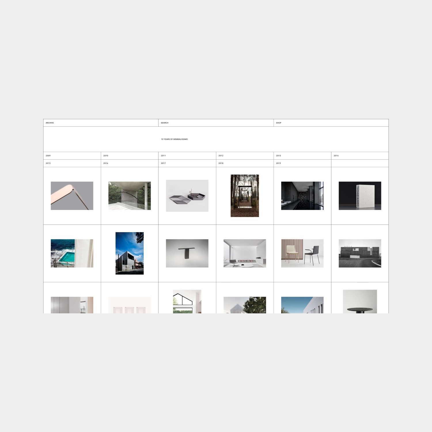
The other notable change we have made is our highly adaptable and modular grid system, which we have emphasised through the use of high contrast. There are a lot of lines in this design, but I didn't want to shy away from that. I wanted the grid to intentionally guide the eye. It also supports the rawness in the design that we were looking for. You can see how well this works across our gallery, shop, and archive. They work in perfect harmony.
I hope this has provided a bit of context and rationale for the creative direction and I hope it's something you can appreciate, if not immediately, then over time. It has been a fun project to work on.
If you have any questions or comments about it, please drop me an email.
