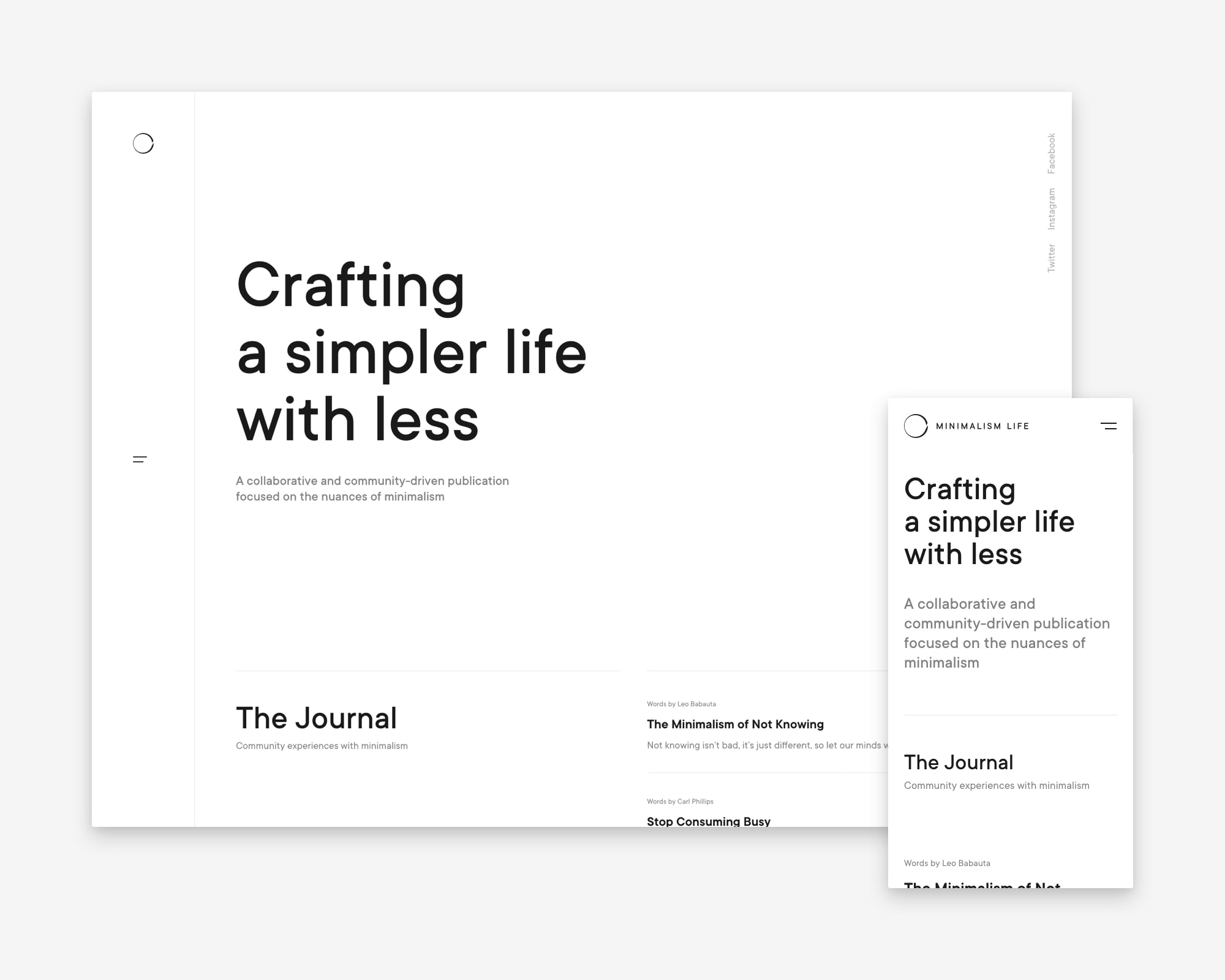
Here we go again. New design. New structure. Better design. Better structure. Better use of typography. Better readability. Better user-experience. Clearer focus. This is minimalism.life version 3. The updated design applies the principle of minimalism in its truest sense (or at least pretty close to it). Not only has the site been built (by Manu) with an ultra-light back-end powered by Kirby, but the front-end has been pared back to focus a lot more on the text and a lot less on imagery. We haven’t entirely removed the use of imagery, but when used, these are functional images, not decorative—meaning they are used to apply context and clarity.

The design is typography-led, making better use of the beautiful TT Commons typeface. Although we do apply various sizes and weights throughout the site, there is only one font-family—also applied to the Minimalism Life word mark.
The information architecture of the site hasn’t drastically changed from the previous version, but we have altered a few elements, including the introduction of a dedicated Book page, driven by the recent publication of Inside Minimalism Vol.1. We have also greatly improved the messaging for our subscription service centred around our collaborative series of weekly essays. And we included a new Questions page, which asks our community a single question per month, inviting you to get in touch with your thoughts, which we aim to round up and share at the end of each month in a dedicated journal article.
With every new version of ML, the underlying concept of the site becomes clearer. We want to communicate that it is a collaborative project driven by a community of those who appreciate and practice minimalism and simple living through various aspects of their lives. I hope with this in mind, the site continues to grow and we continue to offer value to our readers. I don’t know if I can contribute much more than I have done over these four years, but I am optimistic about the project’s future.